

A survey from the UK about colour and its emotional impact asked 26,000 respondents “to associate specific emotions with specific colours.” They discovered that green is the colour most people associate with the future, purple and orange were tied to luxury and, unsurprisingly, red is aligned with feelings of passion. As for the most relaxing colour? Dark blue is the shade that respondents indicated left them “in a state of colourific contentment.”
“Colour has always had an intrinsic relationship with our culture and is woven into our consciousness. The story of colour maps a particular history through our cultural development — telling a much larger story about the way we perceive, value and cherish colour,” says paper manufacturing company G.F Smith’s joint managing director John Haslam.
Indeed, the perception of colour differs according to the culture and location. For example; in most parts of the world, the colour blue is associated with trust, protection and responsibility.
Yellow, is used to express happiness and warmth in most parts of North America. While, Latin America sees shades of yellow as a sign of death, sorrow and mourning.
Red represents happiness, joy and celebration in most Asian countries. In China, the use of red is used heavily for logos, packaging and advertisements. And it has a quite positive meaning in this country, while in some of the Middle Eastern countries, the opposite is true. Red is a symbol of caution and danger. Not exactly the same message.
Green is almost unanimously associated with nature and the environment. However, there are some distinctions between countries worth mentioning. In China, for example, green is often associated with infidelity. A green hat is a symbol that a man’s wife is being unfaithful. In North Africa, green symbolizes corruption, whereas, in Japan, green signifies eternal life. Green is considered to be a symbol of bad news in Israel. Here is a chart to help you understand the different colour perceptions across the world.

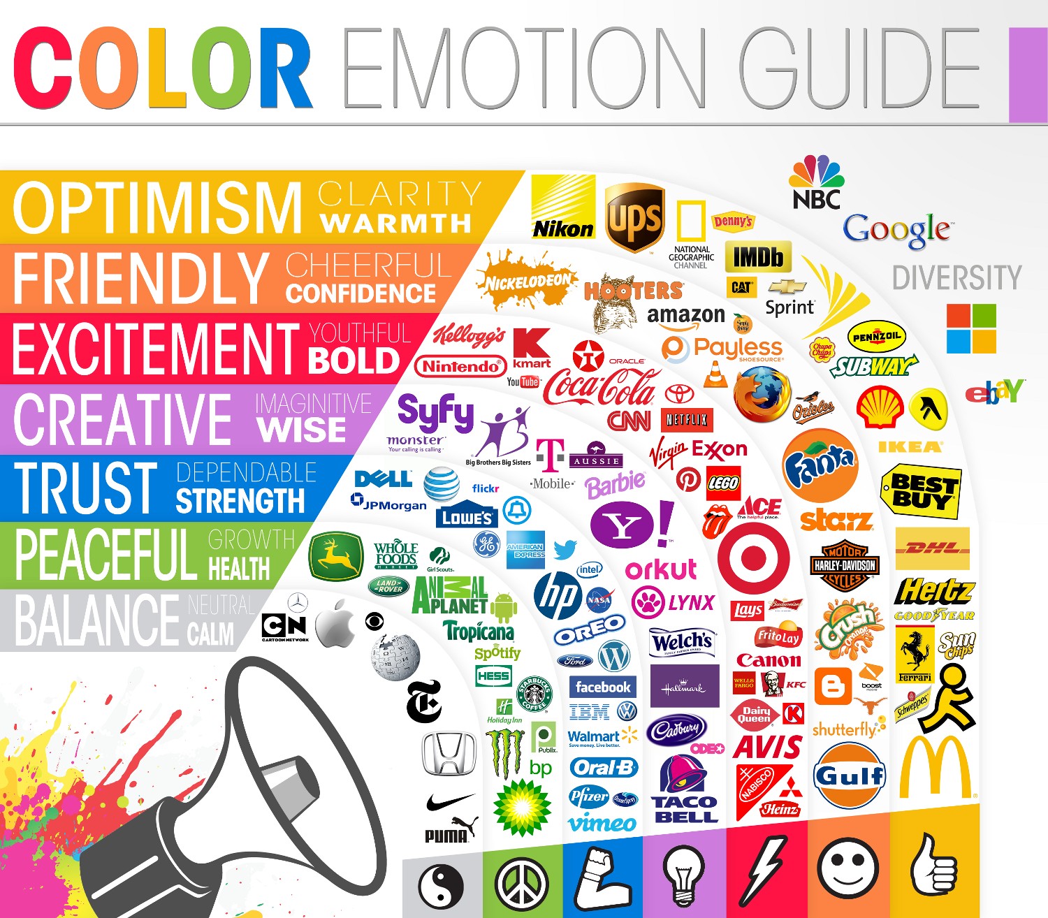
Ant this one is a colour guide that examines the colour choices that were made by well-known companies around the world:
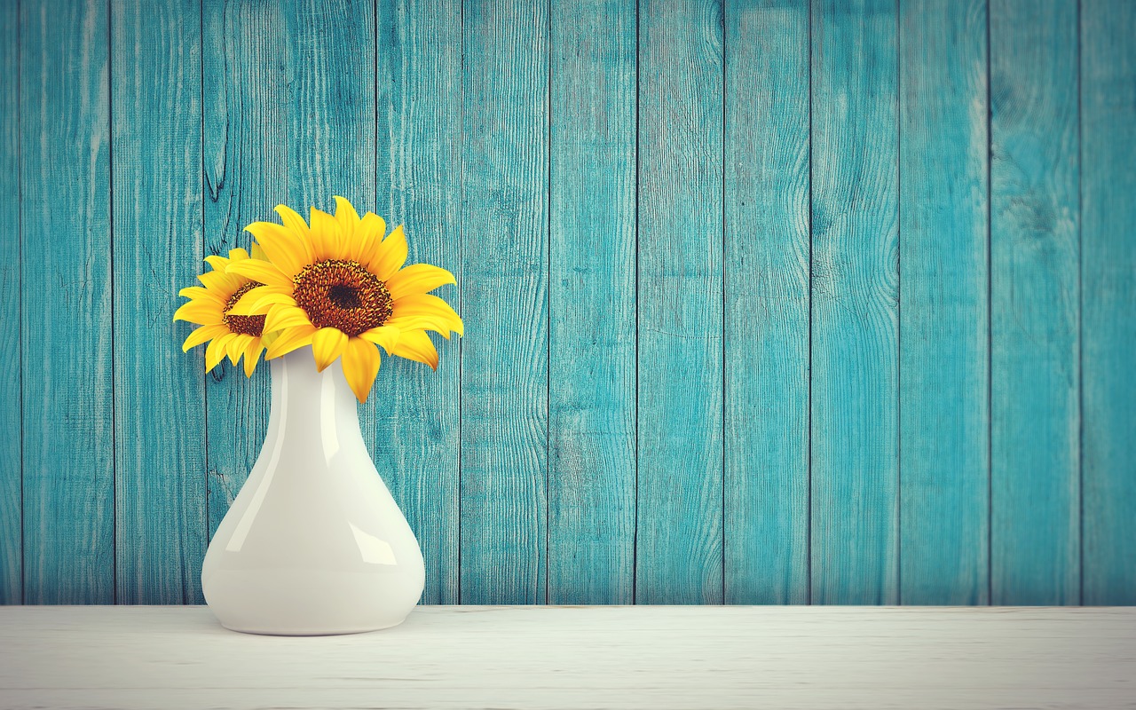
The colours I like the most are yellow and teal. Yellow provides me with the feelings of energy and positivity, while teal has some kind of soothing, calming effect on me. Orange also is a colour that I like very much.
Which ones are your colours? What they mean to you? Do you agree that they have an impact on your brand choices consciously or unconsciously?


+ SHOW COMMENTS
Leave a comment
Wishing you calm and happiness,
Ipek
- Hide Comments